Pie Chart
|
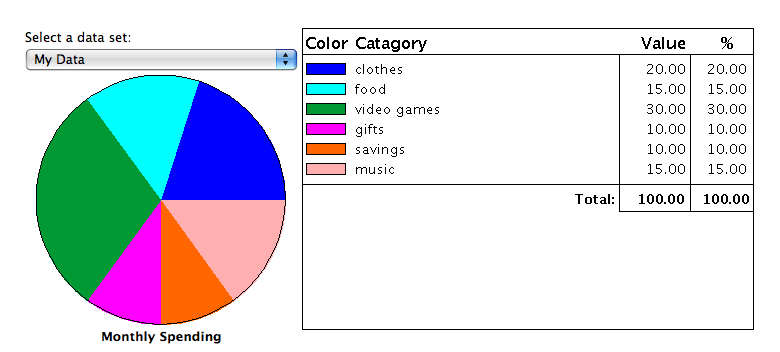
Mentor: What types of graphs have you learned? Student: line graphs, bar graphs, and histograms. Mentor: What type of graph do you think you would use in this scenario: you have a certain amount of money you can spend each month and you want to record how much you are spending in different categories? Student: Um, I think a histogram could work for that. Mentor: It could, but there is another type of graph that would work too: a pie graph. Student: How do you know when to use a pie graph and when to use a histogram? Mentor: A pie graph works well for data with categories and for data that has a total, like 24 hours in a day, or a budget like I mentioned before. Student: Why is a pie chart better for that? Mentor: Lets try using the example of a budget to make a pie chart and I think you will see why. What are some categories you might spend money on? Student: Clothes, food, video games, gifts, savings, and music. Mentor: Ok, lets say your parents give you $100 a month for allowance, how much money would you spend in each of those categories? Student: $20 on clothes, $15 on food, $30 on video games, $10 on gifts, $10 for savings, and $15 on music. Mentor: Alright now we can use the circle graph activity to create a pie chart based on your data. Enter your data into the box below the circle and then click "Update Chart."

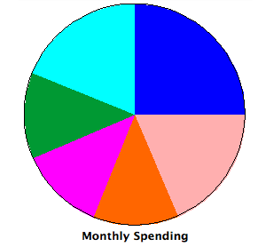
Student: Maybe I should cut back on video games!

Mentor: Maybe you should! Lets see what happens if you decrease your spending in that category. Student: The other sections got bigger!

Mentor: Yes, the sections got bigger because in a pie chart each category is proportional to the other categories. Pie charts provide a very clear image of how categories relate to one another. Student: Oh! Is that what makes it different from a histogram? Mentor: Both histograms and pie charts show the relationships between categories, but in different ways. However, what makes a pie chart different from a histogram is that you can visually see the categories making up portions of a whole. Pie charts make it very clear how one category compares to the total. In other words, pie charts make it easier to see how much of the whole each category represents. Student: I understand! Using the pie chart, it was easy for me to see just how much of my total money I would spend on video games and how much I would spend on food. |
