Page 6
Optimize VolumeNow that we have graphed Mass vs. Volume and Cut vs. Surface Area, let's graph Cut vs. Volume. Once we have this graph, we will be able to see how to optimize volume.
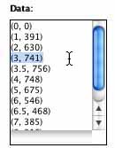
Let's enter our data into the
Data Flyer.
We'll use ordered pairs again, but this time our first number, or
x, is the cut, while the second number, or y, is the volume. For
example, our first box, with the cut of 3, had a volume of 741 units
cubed.  The ordered pair in this case would be (3, 741). Enter in
the rest of the data. After clicking "Auto Window," click "Plot
Data." What are your observations?
The ordered pair in this case would be (3, 741). Enter in
the rest of the data. After clicking "Auto Window," click "Plot
Data." What are your observations?
Cut vs. Volume
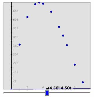
This graph appears to curve like the Cut vs. Surface Area graph. Therefore a line would not be the best fit. We need to find another equation to fit the data like we did for the Cut vs. Surface Area graph. We found the original volume equation using the Volume Applet. The volume can also be found using a formula. We can find a formula by simply multiplying the length * width * height.
| Volume Formula! |
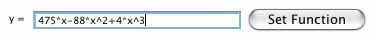
The equation that we will use for volume is y= 475x - 88x2 + 4x3. On the Data Flyer, where it says "y=" put in 475*x-88*x^2+4*x^3. Then click "Set Function."
Cut vs. Volume
Auto Window
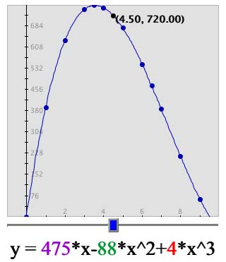
To optimize volume, let's try to find the maximum volume in this window. Since the volume is the y-value and the cut is the x-value, we are going to want to find which x-vaule give us the greatest y-value. Move the blue box from left to right until you find the largest y-value. The maximum is about 3.6.
What does the graph look like? Notice how the graph increases and then decreases. This is not a linear, or line-like, relationship. It resembles a parabola like the Cut vs. Surface Area graph.
We cannot see the whole shape of the graph from this view.
Let's zoom out a little.
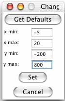
 Click on "Set Window..." and change
"x min:" to -5, "x max:" to 20, "y min:" to -200, and
"y max:" to 800. Then click "Set." What do you notice about
the graph now?
Click on "Set Window..." and change
"x min:" to -5, "x max:" to 20, "y min:" to -200, and
"y max:" to 800. Then click "Set." What do you notice about
the graph now?
Cut vs. Volume
Zoomed Out
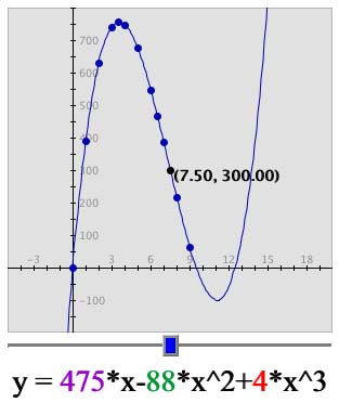
This view of the graph includes values that we will not consider because they are not in our domain, or the limits for the x-values(the cuts). Our domain includes the x-values from 0 to 9.
| Limit that domain! |
It is helpful to use graphs to visualize and approximate data. Graph can show us trends and patterns and we may notice algebraically. By looking at our graphs, we were able to find a relationship between mass and volume, as well as optimize both suface area and volume.
| Optimization Problems! |
The Shodor Education Foundation, Inc.
Copyright © 2003