|
|
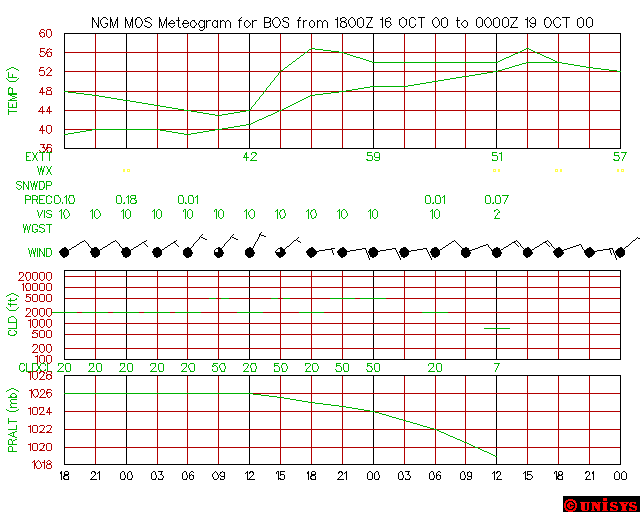
MeteogramsThe meteogram is a collection of graphs (combined into one graphic) that shows how several meteorological variables have changed at one specific weather station over a given period of time, or how the variables are likely to change with time.  (Click on the graphic to see full-sized) This format is generated for over 300 meteorological stations across the continental United States. The updates for theses graphics occur at approximately 0400 and 1600 UTC when on a 0000 to 1200 UTC forecasting cycle. BREAKING DOWN THE METEOGRAMS TITLE BAR As seen on the meteogram under the MOS section, at the top of it, there is a title bar that gives information on the subject of the chart. After the section in the title that gives the chart its definition as a NGM MOS meteogram, it reads "for IND". IND is airport code for Indianapolis, Indiana. All airports have a three letter code like 'IND' and it is from the information found at the airport's report station that these models are drawn from. After the table identification and the location of data (in the airpot code), comes the date and time frame. The first number that appears in the heading is, in this case, the number '6Z'. The unit "Z" identifies as Zulu time, which is also known as Greenwich Mean Time. The name 'Zulu' comes from the notation of the letter "z" in the phonetic alphabet. UTC time, seen earlier on, is in fact, equivalent to Zulu time, and therefor interchangable with it. Thus the reason why both UTC time and Zulu time are both found quite commonly in meteorology. TEMPERATURE AND DEW POINT CHART The temperature and dew point chart is very easy to read. With air temperature measured in degrees Fahrenheit on the x-axis, and dew-point temperature measured in degrees Fahrenheit on the y-axis, the graph is able to identify the low temp. for the day(12Z), and the high temp. for the day(0Z). (HINT: When reading a meteogram, the dew-point label on the chart will be found in the form of EXTT.)  CURRENT WEATHER CONDITIONS Being noted on the chart in the form of WX, it provides data on current weather conditions by the use of various symbols, underestood as standard throughout the meteorilogical community. The different symbols throughout the length of the bar simply represents the different weather by the hours, through the course of the days recognized by the meteogram.  SNOW Seen on the chart notated as SNWDP or SNOW, this section gives recognition to the possibility of frozen precipitation by the hour,within the given days of the forecast. PRECIPITATION Precipitation or PREC on the chart, predicts the amount of rainfall in the constraints of the hours between each new forecast update.
VISIBILITY VIS, below precipitation, identifies the expected visibility,in miles, for periods during the day.
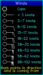
WIND GUSTS AND CLOUD COVER WGST, or just WIND, is the heading for the forecasting of the amount of cloud cover, wind direction, and wind speed. In order to convey such a lengthy amount of information, meteorologists use the standard fashion, Surface Station Model. The Surface Station Model is a combination, of a circle with a tail, and a sequence of barbs on the end of the tail. The following legends are the guides to how to read exactly what these symbols actually mean.   Because the unique characteristics of both the tails and the cloud cover circles, identifying each prediction can be easily seen. CLOUD CHART The next chart to appear on the meteogram is called a cloud chart, which measures the height of the cloud base, and by the usage of assorted lines, gives the identity of the type of cloud cover (corresponding to the Surface Station Model).  First off, the height of the cloud base is measured on the y-axis in feet. Parallel to the y-axis are a series of column lines, each one indicating the height after every 3 hours. Along the x-axis, there are a series of, most probably, inconsistant and unorderly numbers. These numbers simply identify what the alitude of the clouds are (represented by the lines), in a logarithmic fashion (also known as 10^x, where x is a number). The clouds, mentioned so frequently, are symbolized by collection of different lines that are placed on the graph according to their location in the atmosphere. In order to understand what the line symbols mean, use this code. CLEAR: C SCATTTERED CLOUDS: - BROKEN CLOUDS: - - OVERCAST: --- (Single, long line) Notice, on the chart above, the placement of the different lines on the chart. Another fact to remember about the cloud charts is that when the cloud lines are placed on the chart, their center (or the center of the given cloud line) is actually on the column line. For instance, on column line number six, observe that the symbol for broken clouds, stradles that parallel. Also, note that on column line number five, the symbol for overcast, is centered on the parallel. The same goes for the 'C' symbol on line twelve, and the symbol for scatered clouds on line eleven. All are centered on the column line. PRESSURE CHART The pressure chart, subsequent to the cloud chart, is simply a measure of the pressure, relative to the sealevel. The pressure is measured in the standard unit of millibars, which is roughly equal to .03 inches in a mercury barometer.  Confused? Have a question? If so, check out the Frequently Asked Questions (FAQ) page or send mail to the OS411 tutor (os411tutor@shodor.org) with your question! Report technical/content problems here |
|
|