| |
|
Relative Frequency Histograms
A graphical representation
of frequency tables, which conveys the ideas of central tendency is a relative frequency histogram. Relative frequency histograms are constructed
by grouping data into classes and calculating the number of data values
that fall within each class. Bars (of equal width) are then drawn for each
class with a height equal to the corresponding frequency. Look at the following
example of a relative frequency histogram. Notice, that by looking
at the histogram we can easily locate the central trends.
1. Using our given data values, want to group
them into classes of equal size. For this example, we will use three
classes.
|
Time of Day
|
[N2O] 0.05 m
above surface
( nL / L )
|
|
19:37
|
325
|
|
06:37
|
307
|
|
08:37
|
309
|
|
10:37
|
316
|
|
12:37
|
321
|
|
16:12
|
312
|
|
2. Now that we have grouped our data into
a frequency table, we want to create a histogram which demonstrates our
results.
|
Range ( nL / L )
|
Frequency of Measurements
in Range
|
|
300-310
|
2
|
|
311-320
|
3
|
|
321-330
|
1
|
|
| 3. After regrouping our data into a smaller number of categories, notice how the histogram does a good job of displaying the central
tendencies of out data set.
|
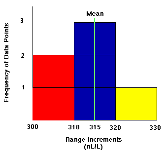 |
| Example of a Relative Frequency Histogram |
If you would like more practice with histograms, there is a helpful
activity located at www.shodor.org/interactivate/activities/histogram.
Report technical/content problems here
|
|