|

Scatter Plot Activity Help
How Do I Run This Applet? This applet allows the user to input a
series of (x, y) ordered pairs and plot them. Parameters such as minimum and maximum value, minimum and
maximum y value, and x- and y-scale can be set by the user or determined by the
applet.
This java applet requires a java-capable browser. If you don't see the applet,
Java may not be functional in your browser or on your machine.
Controls and Output
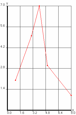
- The area at the top of the screen is where the plot is displayed.

- The textfield labeled Ordered Pairs is where you input the
points you want to graph. The points should be in the form (x, y). The parentheses are
optional, the x and the y can be separated by a tab or a space and there must be a carriage return
between each coordinate pair.
You can plot up to ten sets of points. To do this, separate each set of points by the word
newgraph on a line by itself. You may also specify the color of your graphs by using the
following keywords in place of newgraph: redgraph, bluegraph,
greengraph, purplegraph, crimsongraph, magentagraph, orangegraph,
blackgraph, cyangraph, graygraph, and yellowgraph. If you specify
newgraph each time, the colors will iterate through the order listed.
After you input the coordinates, you must press the Plot button to graph them.

- You can choose from two plot types. "Connected" draws a line from one point
to the next. (Note that before the line is drawn the points are sorted by their x coordinates.)
"Scatter Plot" just draws the points as dots on the graph.

- There are three radio buttons which control the gridlines on the graph. You can chose no grid, light
grid lines or dark grid lines by selecting the appropriate radio button.

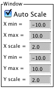
- The Window settings determine how the graph will appear on your screen. X min
and X max are the minimum and maximum x-values displayed on the graph. Similarly for Y min and Y
max. The X scale is the distance between vertical gridlines if Show Grid is checked. The Y
scale is the distance between horizontal gridlines if Show Grid is unchecked. If the Auto
Scale box is checked, Lineplot will choose appropriate values for you to view all data on the
graph. If you uncheck that box, you can override Lineplot's values with your own. Any changes
you make to the window parameters will take effect the next time you click the Plot button.
Also note that while the Auto Scale box is checked, the min/max/scale text boxes are
uneditable.

- By entering text into the Title= field you can change the title of your graph.
After changing the title hit plot to see the new title at the top of your graph.
- By entering text into the Horizontal Axis = field you can change the title of your x axis.
- By entering text into the Vertical Axis = field you can change the title of your y axis.
After changing the title hit plot to see the new title chnges on your graph.

- Zoom/Pan buttons. In the upper right corner of the graph, there are three
buttons with pictures of magnifying glasses. From top to bottom these buttons represent zoom
in, zoom out, and pan, respectively.
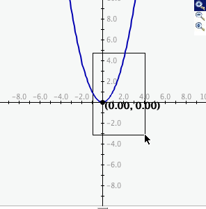
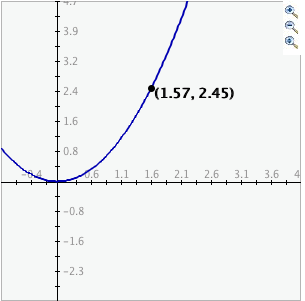
- To zoom in, click the top button to depress, then click and drag over the area of
the graph for which you wish to zoom to. The images below show the preimage
as the user drags over the area in which to zoom and the resulting zoomed image. Note that
after clicking and dragging over the selected area, the zoom in button is automatically
released.
- To zoom out, simply click the middle button. The graph will automatically zoom out
by doubling the min and max values of the axes.
- To use the pan feature, click the bottom magnifying glass button to depress it.
Click and drag over the graph and the graph will pan around according to the movement of the
mouse. Upon releasing the mouse, the pan button is released.

|

