|
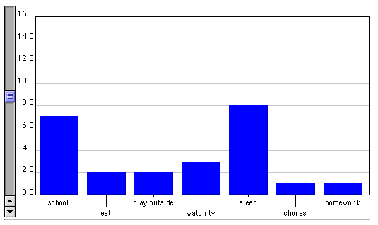
The Bar Graph applets allow the user to graphically display data frequency using a bar graph. This particular applet allows the user to enter his/her own data as well as manipulate the y-axis values. The ability to manipulate the y-axis values allows the creation of potentially misleading graphs.
Bar graphs similarly to histograms are graphical data representations
based on frequency. Histograms are a type of bar graph. The feature which
distinguishes a histogram from a bar graph is that the each bar on a histogram
represents a range of data, where each bar on a bar graph represents a specific
category.
For example:
Class Resources
|