|
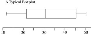
Mentor: Now I would like to help you with another graphing method that allows you to compare different categories of data. It is called a box plot. It looks something like this:
Each one of the vertical lines represents an important number related to the data set: The first and last line (leftmost and rightmost) are drawn at the lowest and highest data values. The three lines that form the box are drawn 25%, 50%, and 75% of the way through the data. These five numbers, the lowest, 25%, 50%, 75% and the highest, together are called a 5 number summary. Student: Summary of what, the data? Mentor: Right. In the past we have talked about the mean of the data being the average of all of the data points. There is another important 'middle' number. It is called the median (M). Student: I know that. The median is the mid-point of the data. If you were to put the data on a seesaw lined up in order, the median would be data value on the balancing point, like this:  Mentor: That's right if there is an odd number of numbers, but if you have an even number of numbers, you average the two middle numbers and report that as the median. You do not add this number to the list. It is simply the median value, and it marks the fiftieth percentile of the data.  Now let's look at splitting the halves in half. Student: You mean splitting the data into quarters? Mentor: Yes. We want to talk about the twenty-fifth and the seventy-fifth percentiles of the data. The twenty-fifth percentile is called the first quartile (Q1) and the seventy-fifth percentile is the third quartile (Q3). The first thing that I want to tell you is probably the most difficult thing to remember about finding the first and third quartile numbers is what happens to the median in the two situations. Student: What two situations? Oh, you mean when the median falls on a data point and when it falls between data points. Mentor: Right, if the median falls between two data points then to find Q1 you simply take all the data below the median and find the middle number. Likewise to find Q3, you take all of the data above the median and find the middle number. If the median falls on a data point then it is used when you find both of the quartile values. I think that we need to practice. Give me some data sets.
Student: Let's use
Mentor: Good. Now for the quartiles. For 
Student: Right, I get that. Let me try the other set:  Mentor: Right! That was great. Let's look at what we have using the second data set. We have a median of 12, a first quartile, or Q1, of 6.5 and a third quartile, or Q2, of 19.5. Those are three of the five numbers in the five number summary. The other two are the minimum, or Lo, and the maximum, or Hi. So now we can put it all together. Student: Okay.
Mentor: The last couple of numbers that are of interest are the ranges. The range of the data is the Hi minus the Lo. Then the other range is the interquartile range (IQR). This is when you subtract the first quartile from the third quartile. Do you know what the interquartile range represents? Student: The middle fifty percent of the data. Mentor: Right. Student: Next are we going to talk about the graph? Mentor: That's next. Each number in the five number summary represents one of the vertical lines on the plot, like I showed you before. Let's look at it again.
Student: I get it. Then the interquartile range will determine how long the box is and where it is between the Hi and Lo. Mentor: How long the box is determines the length of the whiskers; or the vertical lines. If you have a larger data set, you do not want to spend all of your time counting out data points. Mentor: You can look at as many distributions you would like to with this method. When you plot them on the same axes, you can compare different aspects of those distributions. Student: So if I took everyone's height from class, I could split the numbers into boys and girls and compare their heights. Mentor: That is right. What other ways could you split up data to compare distributions within the whole group? 
Please direct questions and comments about this project to Addison-Wesley math@aw.com © Copyright 1997-2001 The Shodor Education Foundation, Inc. © Copyright 2001 Addison-Wesley. All rights reserved. |

